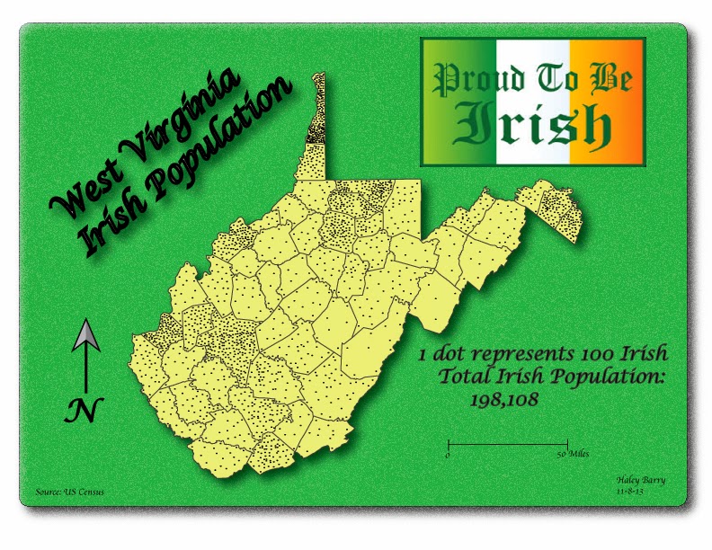
The first map I choose for my top five is from Haley Barry; dot
density map. The colors stand out well
with the map. I like the font for the
title and the shadow that was applied to the text was good. Overall, the map looks great.
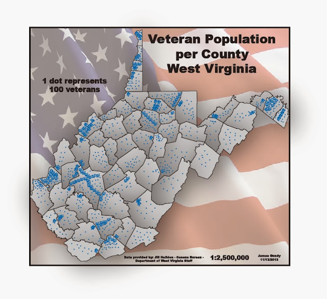
The second map is from James. I choose his dot density map. I like the color selection for the map. The flag in the background was a good idea
and goes well with the data.

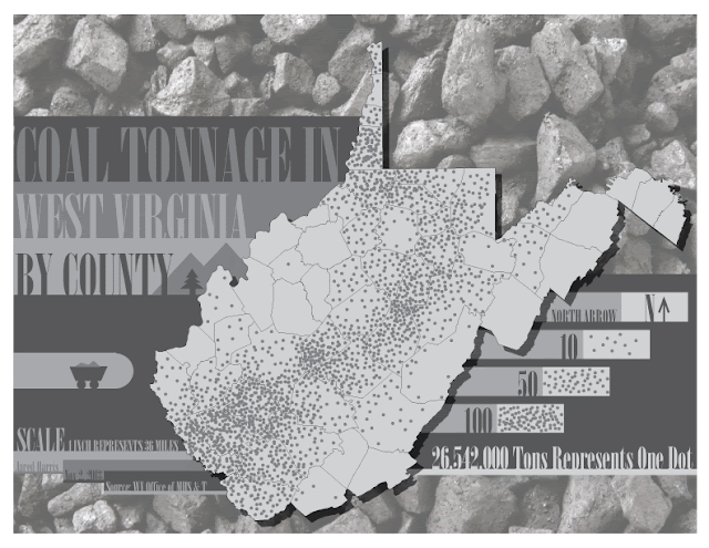
The third selection is also a dot density from Jared. He did not choose any colors for the map, but
looks good. I like how he boxed the text
for the title and the dot size is good.
Nice map.

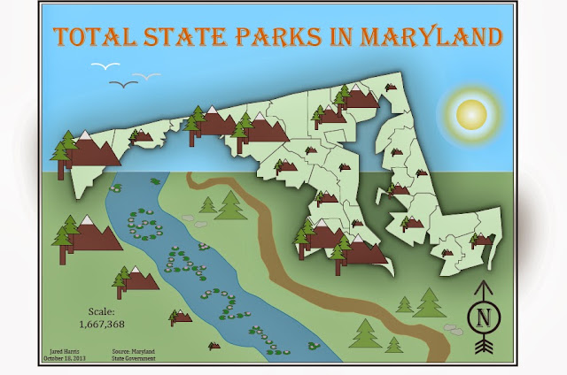
The fourth selection is the graduated symbol map from
Jared. I like the graphics he uses to
represent the data. The colors and the
drop shadow were well used in the map. Overall,
it was well design, very creative.

Last map is the bivariate from Nicole. I like the background and the different type
of fonts she uses for the map. The
colors go well with the map. Overall,
the map looks great, especially with the drop shadow.

5 Favorite Weekly blogs:
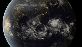
1. I like Cory's Super Typhoon Haiyan map. Interesting map showing the globe.
2. Dot density from Cory. I like the selection of the colors in this map; blue and black go well together.
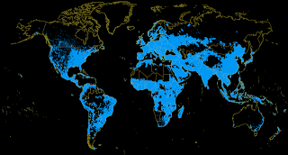
3. Global energy Grid by Nicole. This map is well made. The colors go well with the topic

4. Bivariate map by Haley. An interesting map. I like the colors. I like the boundary lines around the U.S.

5. Dot density map example by Jennifer. Good size of dots. This is not an easy map to make with the dots. This one looks nice.


5 Favorite Weekly blogs:
1. I like Cory's Super Typhoon Haiyan map. Interesting map showing the globe.

2. Dot density from Cory. I like the selection of the colors in this map; blue and black go well together.

3. Global energy Grid by Nicole. This map is well made. The colors go well with the topic

4. Bivariate map by Haley. An interesting map. I like the colors. I like the boundary lines around the U.S.
5. Dot density map example by Jennifer. Good size of dots. This is not an easy map to make with the dots. This one looks nice.
No comments:
Post a Comment