Wednesday, December 11, 2013
Sunday, December 8, 2013
Extra credit Option 2: Top 5 maps for the semester
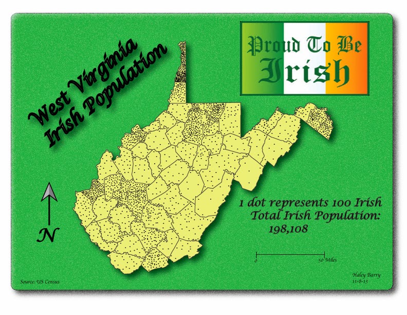
The first map I choose for my top five is from Haley Barry; dot
density map. The colors stand out well
with the map. I like the font for the
title and the shadow that was applied to the text was good. Overall, the map looks great.

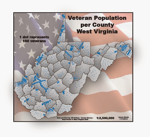
The second map is from James. I choose his dot density map. I like the color selection for the map. The flag in the background was a good idea
and goes well with the data.

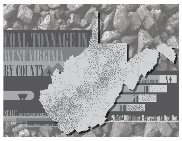
The third selection is also a dot density from Jared. He did not choose any colors for the map, but
looks good. I like how he boxed the text
for the title and the dot size is good.
Nice map.

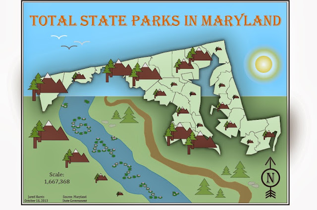
The fourth selection is the graduated symbol map from
Jared. I like the graphics he uses to
represent the data. The colors and the
drop shadow were well used in the map. Overall,
it was well design, very creative.

Last map is the bivariate from Nicole. I like the background and the different type
of fonts she uses for the map. The
colors go well with the map. Overall,
the map looks great, especially with the drop shadow.

5 Favorite Weekly blogs:
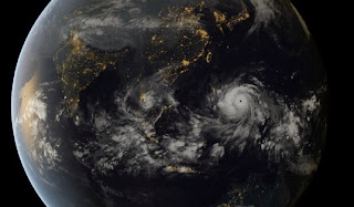
1. I like Cory's Super Typhoon Haiyan map. Interesting map showing the globe.
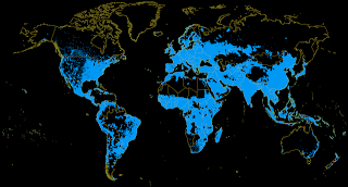
2. Dot density from Cory. I like the selection of the colors in this map; blue and black go well together.
3. Global energy Grid by Nicole. This map is well made. The colors go well with the topic

4. Bivariate map by Haley. An interesting map. I like the colors. I like the boundary lines around the U.S.

5. Dot density map example by Jennifer. Good size of dots. This is not an easy map to make with the dots. This one looks nice.


5 Favorite Weekly blogs:
1. I like Cory's Super Typhoon Haiyan map. Interesting map showing the globe.

2. Dot density from Cory. I like the selection of the colors in this map; blue and black go well together.

3. Global energy Grid by Nicole. This map is well made. The colors go well with the topic

4. Bivariate map by Haley. An interesting map. I like the colors. I like the boundary lines around the U.S.
5. Dot density map example by Jennifer. Good size of dots. This is not an easy map to make with the dots. This one looks nice.
Friday, December 6, 2013
Extra credit Option 1: Handy Illustrator technique: Using the eyedropper tool
One of the illustrator techniques was learning to use the
eyedropper tool. This tool is very
useful when making a choropleth map. This
tool can be used to copy the color from one object to another. It can also be used to copy other attributes
from an object to the other.
1. Select
the object whose attributes you want to change.
2. Select
the Eyedropper tool.
3. Move
the Eyedropper tool onto the object you want to copy the attributes from and
click on it.
The shortcut to do this is:
1. Select
the object you want the attributes from.
2. Select
the eyedropper tool and click on the object you want to apply the changes. Continue to click on object to apply changes
if desired.
Using the shortcut saved me a lot of time when making the maps. I hope it does the same or did the same for you.
Thursday, December 5, 2013
Monday, November 18, 2013
Friday, November 15, 2013
Map of Super Typhoon Haiyan
This map shows how big the tropical cyclone is.
Link: http://socialistresistance.org/5628/after-the-super-typhoon-haiyan-solidarity-urgently-needed
Tuesday, November 12, 2013
Monday, November 11, 2013
Wednesday, November 6, 2013
Final Project Proposal
The subject of the map will be based on Facebook users. The reason I chose this topic is because I
would like to find out how many people are actually using it. Is it being used in rural areas as it is
used in the suburbs? It will be
interesting to see the areas where people most use facebook. What do you think?
I was having a hard time choosing a subject for this
project. After browsing so many websites
I found the data provided for facebook users.
I did a little research on it and there are not a lot of maps for this
subject so I decided to take on the challenge of mapping it. The following is the link where the data
resides: http://www.internetworldstats.com/unitedstates.htm#AL
This is a map for computer users who have time to check out
the map and would like to know more details on what people are doing when using
the internet. If you are a seller and
would like to target facebook users, this map can help you figure out specific
States to choose.
For this data I would like to create a Dot Density map. I could also use choropleth map for this
data, but I feel that dot density map gives you a different perspective of the
data. It gives you a better
understanding for locating the users by looking at the point features; unlike
choropleth maps where you are just looking at a shaded polygon with some
values.
The scope of the map will be nationwide with data per State.
I plan on plotting points around each
state where one point will represent a specific number of facebook users. Points will be placed randomly around each
polygon.
The basemap used for this map will be the United States
basemap. It will be the same one that
was provided for lab 6.
The data comes from the Internet World Stats: usage and
Population Statistics: http://www.internetworldstats.com/unitedstates.htm. It will be facebook users for March 31/11
and it is based on the 2011 population.
The data seems accurate based on population comparison. We know that not everyone uses facebook and
this is depicted through the numbers on the data provided.
Expected production steps:
if Dot density map is chosen I would need to spend time daily working on
it to get done by the due date.
One challenge for
this project was obtaining the data, but I have found it. I wanted to obtain data per county, but have
not been lucky to find it. The data I
have found is for one day period only.
Doing a Dot Density map will take a lot of time because I would have to
plot a lot of points for each state.
With the data I can easily make a choropleth map. The challenge for this would be to
standardize the data and classify it into equal intervals.
Tuesday, November 5, 2013
Monday, October 28, 2013
Friday, October 25, 2013
Monday, October 21, 2013
Monday, October 14, 2013
Lab6: Color Choropleth Map
When comparing the web version map with the printed copy map, not a lot of differences were noticed. The color yellow looks the same in both maps. The soft orange also looks alike in the two maps. The bright orange looks sharper in the web map. The vivid red shifted the most in the web map than in the printed map. The strong red looks closest in the web map than the printed one. The background color looks a lot better in the web than in paper. Overall, both maps look good, but the web map looks better because colors were shifted the most.
Wednesday, October 9, 2013
Classification color map
Link to this map:http://www.nrdc.org/health/climate/drought.asp
This map has good selection of colors.
This map has good selection of colors.
Tuesday, October 1, 2013
Example of a Choropleth Map
Link :https://www.google.com/search?q=choropleth+map+sample&ie=UTF-8&hl=en&tbm=isch&source=og&sa=N&tab=li#facrc=_&imgdii=_&imgrc=aTdFJZ9MV0nlFM%3A%3BAT-72qR5gr-dIM%3Bhttp%253A%252F%252Fi.stack.imgur.com%252FZfyUv.png%3Bhttp%253A%252F%252Fgis.stackexchange.com%252Fquestions%252F3087%252Fwhat-makes-a-map-be-classed-as-badly-designed%3B593%3B600
Friday, September 27, 2013
Monday, September 16, 2013
Tuesday, September 10, 2013
This is the Hobo-Dyer Projection
Thursday, August 29, 2013
Subscribe to:
Comments (Atom)


